
Thrive
App to manage the ups and downs of campus life.
For UT Austin students.
Overview
Thrive is an app that helps busy students make small changes in their routines that can have a powerful impact in their daily lives.
Students will find short videos of actual UT Austin students sharing their own stories as well as interactive activities designed to help them apply these concepts to their own unique experience.
Goal:
-
Design the intuitive and accessible app interface
-
Enhance user engagement
-
Increase awareness of the Thrive app among students
Process(Click the button below to see each section):
60 Responses
12 Participants
12 Participants
5 Participants
5 Products
Client:
UT consulting and mental health center(CMHC)
Team:
Xiaomeng Mu
Xin Su
Meng Li
Timeline:
Oct. 2017-Dec. 2017
My Role:
App redesign
Usability testing
Affinity diagram
Competitive Analysis
Survey: the understanding of wellness App
The First Impression of Thrive App

Wellness Management Tools For Students

From the survey, we found that most students didn't think that Thrive was a wellness app at the first time.
And they also mentioned some tools they used frequently to manage their wellness. We conducted competitive analysis for these tools to see what features they have that could also be beneficial to the future improvement of Thrive.
Competitive Analysis


Solution:
-
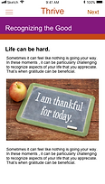
Add pictures.
-
Change the font height, it is too crowded to read now.
-
Make content more concise.
Task Flow: Users tend to skip tasks.
Half of the users did tasks uncarefully and tried to skip them.
-
Users lost patience when they cannot see the end
-
Quiz need be more fun and engaging and the responses are not enough to include all types of users.
Solution:
-
Add progress bar.
Interview: Learn about target users
We interviewed 12 UT students including undergraduates, graduate and Ph.D to learn about their expectation for wellness app and experience for Thrive.
Through the project, our team made multiple iterations and edits on the interview design and then use affinity diagram to externalize and meaningfully cluster insights from research.


Affinity diagram for interviews
Key Findings
1/
Stress issues are common
-
Most of the participants met personal mental health issues.
-
Mental Health issues mostly impact on work&study, diet, sleep
3/
Uncommon to treat mental issues with an app
-
About half of participants seek help from friends or experts.
-
When seeking for help, they do not make use of wellness app.
2/
Unfamiliar with wellness app
-
Most of them never used mental wellness app
-
Participants do not know what to expect for a wellness app
4/
Flyer design hardly attract people
-
"Some of the icons used are hard to understand. The design needs to be improved."
-
"The word "Thrive" does not make sense to me."
Usability Testing
After learning about user expectations from the interview, our team worked together to identify usability testing tasks. During the test, we observed how participants interact with the App and go through module content, and asked why they performed certain actions. We also let three participants keep using "Thrive" App to record their follow-up feedbacks.
We used affinity diagram to externalize and cluster key problems based on user feedback. 12 different card colors represent 12 participants. Based on that, our team decided our final redesign ideas..
Affinity diagram for usability testing
Home page: Engaging but hardly understand the app purpose.
Users can only get very limited information from the icon and description on each module card.
They think the app is to provide:
-
UT campus service
-
A platform for people to make friends
-
A forum to share information


Video: Users do not like to watch the whole video.
Most users stopped the video halfway or just fast forward the video.
-
Users said the video content could be more instead of talking in the same way.
-
Some hope to disable video autoplay.


Article content: Users do not read article content carefully
Most users skimmed text content or skipped reading.
-
Users found the content too wordy, not concise.
-
Some found the text content poorly designed, feeling hard to read.


Interaction: Interaction consistency needs to be improved
Most users got stuck when trying to go forward or back.
-
There is no visible go back button.
-
Users can swipe right to go back, but cannot go forward when swipe left.
Solution:
-
Add go back/forward arrow.
Original Design
Design Recommendation

Original Design
Design Recommendation


Original Design
Design Recommendation


Demo
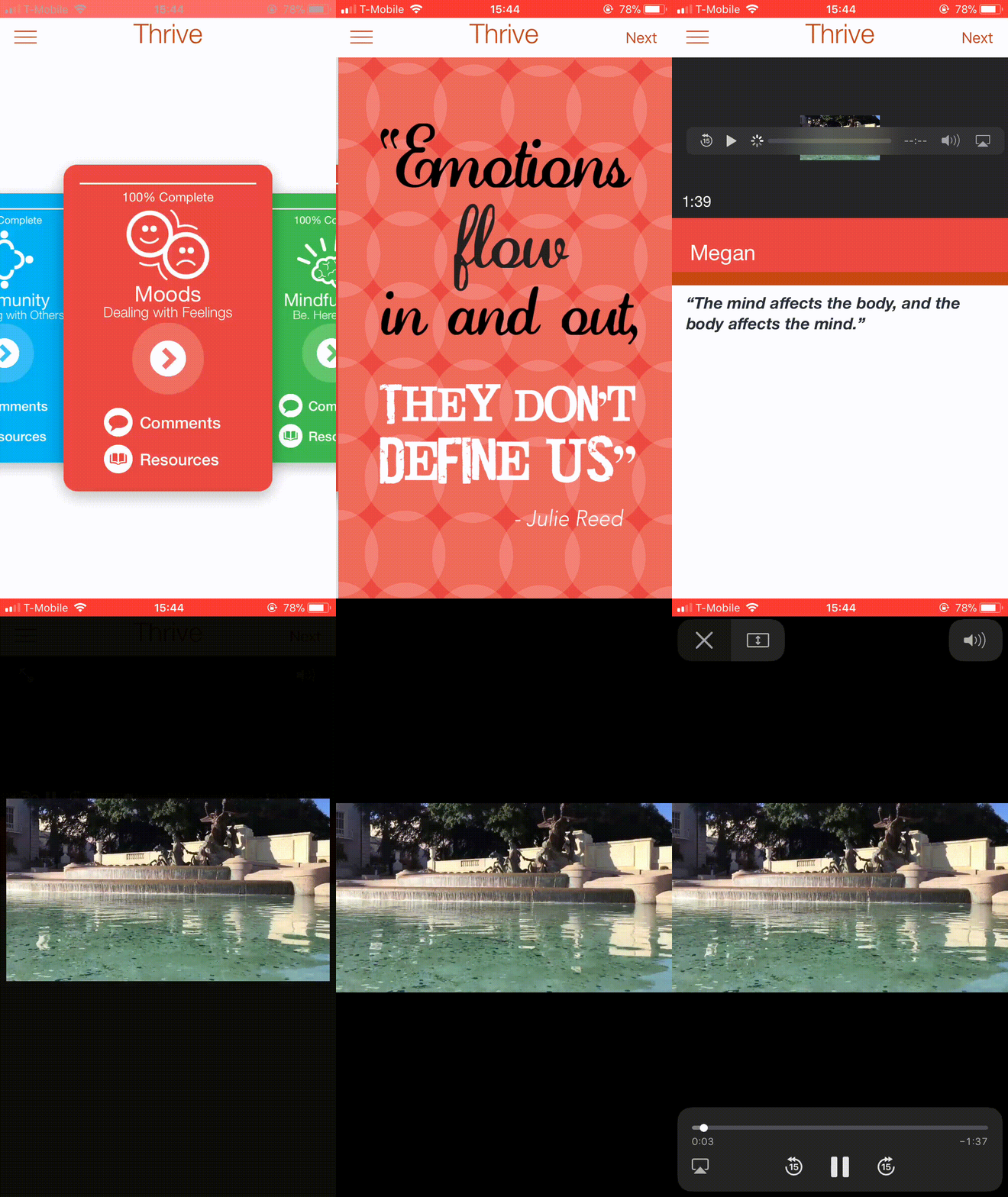
I created the demo to describe user flow of Thrive, taking moods mode as an example.
Usability Testing - 2nd

Laura
Major: Computer Science
"I love the instruction pages! It helps me know what is Thrive. In addition, student videos let me know their stories and how to solve some mental problems. I will introduce the App to my friends suffering from mental stress.”

Crystal
Major: Psychology
"The interactive quiz, feedback and daily notification really motivated me to perform actively in class.''

Neal
Major: Industrial Design
"I love the intriguing homepage and I think it would be better if the app can keep records for every user.”